Personal trainer website examples: 8 designs and what each gets right
Eight live website examples for personal trainers, online coaches and studios, and the parts of each worth copying for your own site.

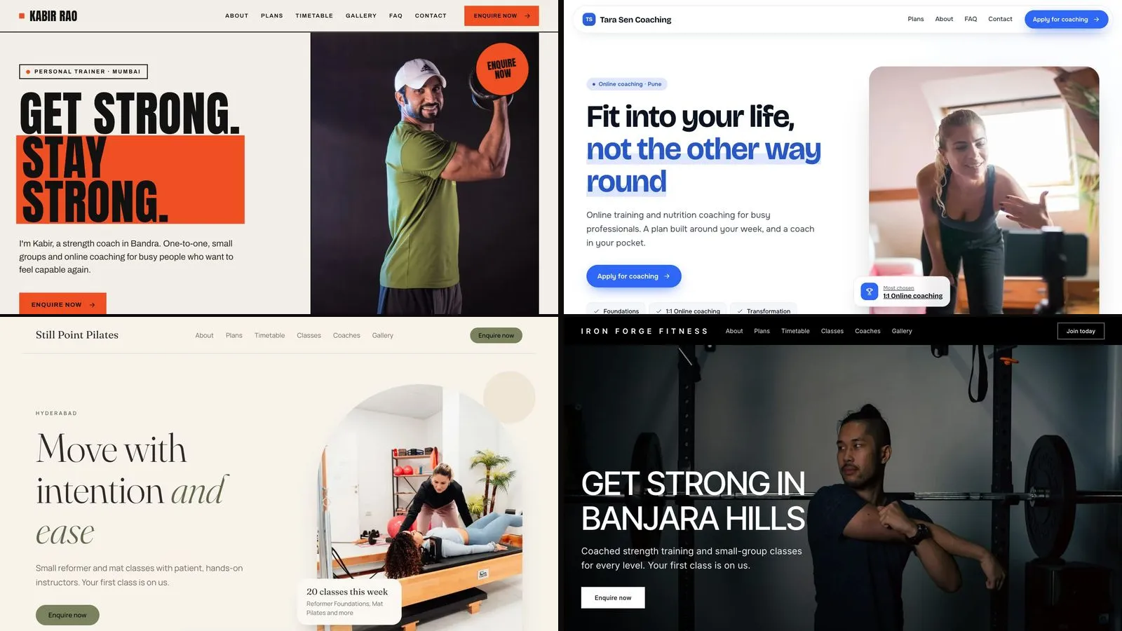
The best personal trainer websites do four things in the first screen: say who the trainer helps, show where or how they train, make the next step obvious, and look good on a phone. Our recommended way to study them is to open real working pages, not screenshots, so every example below is a live demo website you can visit now. Each one is a fictional business built with one of the 8 themes of the Trainaq website builder, and each section ends with what to copy for your own site.
A note on why these examples and not famous trainers' sites: other people's websites change, and a design that works for a celebrity coach with a big audience tells you little about what works for a trainer starting out. These demos use the same layouts real coaches publish, with realistic packages, timetables and FAQs, and they are marked "Demo website" at the bottom of every page.
What makes a good personal trainer website?
A good personal trainer website answers a visitor's three silent questions in under ten seconds: is this for someone like me, what does it cost, and how do I start? Everything else, from the colours to the photos, supports those answers. The examples below each lead with a different answer, which is why they look so different.
The same checklist runs through all eight:
- A headline that names the client and the result in plain words, not a slogan.
- Packages with prices, or at least a clear starting point, so nobody has to ask.
- One main button, repeated: enquire, book a trial or apply.
- Real photos of the trainer at work.
- A short FAQ that removes the usual worries.
- Contact that works on a phone: a form plus WhatsApp or a call button.
Google indexes the mobile version of a site first (Google Search Central, mobile-first indexing), and most clients will find you on a phone, so judge every example on a phone too.
1. Persona: a personal brand that leads with the trainer
Open the Persona demo: a fictional strength coach in Mumbai, with his photo filling half the screen and a three-line headline in condensed poster type. The orange block behind the second line is the brand colour, and it repeats on every button.
What to copy:
- Your face first. People hire a personal trainer, not a gym. A large, honest photo does more than any feature list.
- A headline with a promise you can keep. "Get strong. Stay strong." says what you do without promising kilos or dates.
- Credentials as small facts. Under his story sit three short highlights, such as a certification and the year he started coaching.
Persona is the theme most solo trainers start with. See how it fits a full personal trainer website, with the checklist of sections.
2. Ascent: an online coach who takes applications
The Ascent demo is a fictional online coach in Pune. The page is crisp white with rounded cards, the headline is about fitting training into a busy week, and every button says Apply for coaching instead of Enquire.
What to copy:
- A How coaching works section. Three or four steps (apply, get your plan, train, check in) answer "what happens next?" before anyone asks.
- One plan marked Most chosen. Highlighting a single plan makes the choice easier than a grid of equal boxes.
- An application, not a contact form. A form that asks for the plan and a goal gives you what you need to reply well.
Online coaches have a longer read on online coach websites.
3. Nourish: a nutrition coach with a softer voice
The Nourish demo is a fictional nutrition coach in Bengaluru: oat and cream colours, a friendly serif, and food photos in soft round shapes.
What to copy:
- Tone that matches the client. Nutrition clients are often anxious about food. Warm colours and gentle words lower the stakes.
- No promises. The headline talks about feeling at home in your body, not about weight lost. That is better for clients and safer for you.
4. Signature: a studio with a team
The Signature demo is a fictional training gym in Hyderabad. A large training photo, white uppercase headline, and a monochrome page where the brand colour is used only for accents.
What to copy:
- Location in the headline. "Get strong in Banjara Hills" tells local visitors at once that you are near them, and it is the kind of phrase people search for.
- A coaches section. With a team, each coach's photo, title and short bio help a client choose before they arrive.
5. Pulse and 6. Rhythm: group training and classes
Pulse and Rhythm show the same fictional gym two ways. The Pulse demo is a dark page with a gradient headline, built for energy. The Rhythm demo puts a black hero first, then white sections with thick rules and class cards.
What to copy:
- The timetable as a selling point. For small-group training, the class times are the product. Both themes show the next 14 days of classes, with "Few spots left" and "Full" as classes fill.
- "Your first class is on us." If you offer a free trial session, say so in the first screen and make Book a trial the main button.
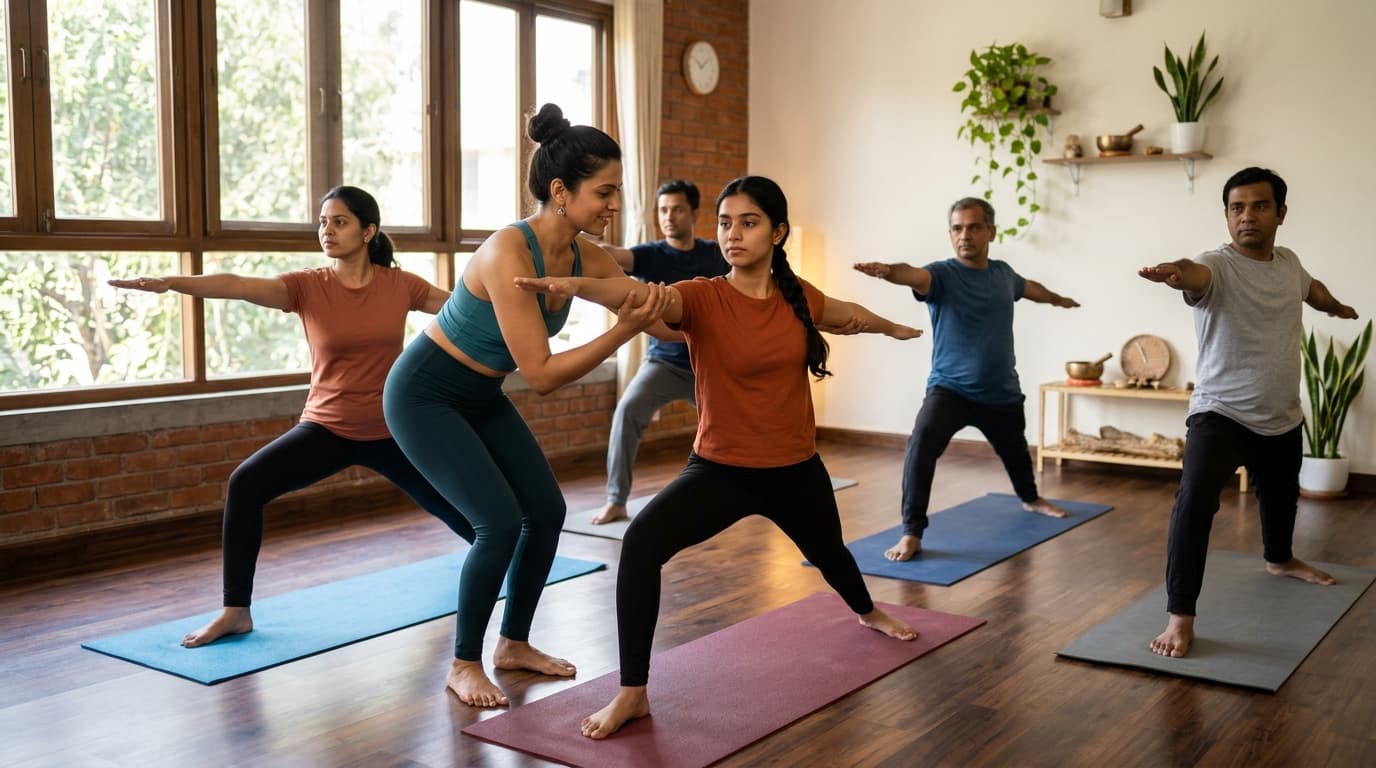
7. Haven and 8. Zen: calm pages for Pilates and yoga
The Haven demo is a fictional Pilates studio with arched photos, warm ivory and a note that 20 classes run this week. The Zen demo is a fictional yoga studio in cream and stone with light serif headings.
What to copy, even if you coach strength:
- White space. Fewer, larger elements feel more premium than a crowded page.
- One sentence of welcome. "Find your breath again" works because it is short. Your headline can be short too.
There is more on these two in yoga and Pilates website templates.
What do the best examples have in common?
They all make one action obvious and repeat it, they show prices or a clear first step, and they keep the first screen simple on a phone. None of them uses stock slogans like "transform your life", none lists every service on the home page, and each one sounds like a person.
A quick way to test your own design against these examples:
| Check | Why it matters |
|---|---|
| Can a stranger say who you help after five seconds? | If not, the headline is too vague |
| Is a price or a first step visible without scrolling far? | Without one, people message to ask, or simply leave |
| Is there one main button? | Two different calls to action split attention |
| Does it look right on a phone? | Most visitors arrive from Instagram or WhatsApp on a phone |
| Are the photos of you? | Stock photos of models read as a template |
How to build a website like these
Every example above is a theme of the Trainaq website builder, so you can start from the one you like and see your own business in it. You answer 5 questions, AI writes a first draft from your answers and your Trainaq packages, and you pick a theme with your own words already in it. Your packages, prices, classes and coaches then stay up to date on the site by themselves, and enquiries go to Leads on Pro and Studio or to your email on Starter.
Two honest limits: visitors cannot pay or book on the site itself (Join and Book open your enquiry form, and you send a payment link from Trainaq), and the builder is free for 7 days, then paid. The step-by-step version is in how to build a personal trainer website.
FAQs
Can I copy one of these designs for my own website?
Yes. Each example is a theme you can pick in the Trainaq website builder, and it fills with your own words, photos, packages and timetable. Switching to another theme later keeps your text as it is, so you can try two or three before you publish.
Are these real personal trainers' websites?
They are demo websites with fictional businesses, marked "Demo website" on every page. They use the same themes and layouts that real coaches publish, with sample packages, classes and FAQs, so you can judge the design without copying anyone else's site.
What pages should a personal trainer website have?
One strong home page is enough to start: headline, about you, how you coach, packages, an FAQ and an enquiry form, plus a privacy page. Add a timetable if you run classes and a page per location if you have more than one.
How much does a website like these cost?
On Trainaq the website builder is free for 7 days with no card, then a paid add-on on Starter and Pro, and included in Studio. The current price, in your currency, is on the AI website builder page.
Sources
- Google Search Central, mobile-first indexing (developers.google.com)
- Persona demo (persona-demo.trainaq.app)
- Ascent demo (ascent-demo.trainaq.app)
- Nourish demo (nourish-demo.trainaq.app)
- Signature demo (signature-demo.trainaq.app)
- Pulse demo (pulse-demo.trainaq.app)
- Rhythm demo (rhythm-demo.trainaq.app)
- Haven demo (haven-demo.trainaq.app)
- Zen demo (zen-demo.trainaq.app)